We all are great lovers of fast food and love to visit popular restaurants like McDonald’s, Dominos and many like these. While we all love the vibe and food there and even recognize their logos by heart, there would be very few people who actually know the reason behind the colour code.

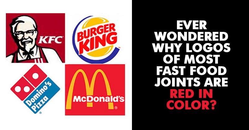
If you notice carefully, almost all the big fast food restaurants use red and yellow colour on their logos. But do you know the reason? Most of you don’t.
Here’s why Fast Food restaurant use Red and Yellow colour on their logos.
The reason behind using these two colours is related to psychology.
Red colour has a tendency to evoke the feelings of stimulation and hunger so it’s clear why restaurants are fans of Red.

Yellow on the other hand evokes happiness and friendliness.
So it’s clear that use of these colours on the logos of fast food restaurants is not accidental but result of a lot of thought process.
We hope it helped you update your knowledge base.


