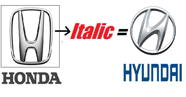
Honda Motor Co. Ltd is a popular Japanese automobiles & motorcycle manufacturer company which was founded by Soichiro Honda in 1948. Since 1959, Honda has been the world’s largest manufacturer of motorcycles. On the other hand, Hyundai Motor Company is a South Korean company and was a subsidiary of Hyundai group (first founded as a construction company in 1947). Hyundai Motor company was founded in 1968, 9 years after the Honda was founded.
Comparing the Logos of these two we normally get the question – Did Hyundai copy Honda’s Logo?
(This is because – as Honda was founded first and Hyundai later. Also, there is no clear information regarding the years in which their logos were started)

To decode this question let us know what does their logos mean:
Honda:
Honda is the world’s largest motorcycle manufacturer and also world’s largest manufacturer of internal combustion engines in volume. It produces 14 million engines each year. It is the 8th largest automobile manufacturer in the world.
Coming to the logo – Honda logo represents the image of the company very elegantly. Honda automobiles come up with the ‘H’ logo in a rectangular trapezoidal frame and the shipping carriers are allotted with Honda Marine logo. ‘H’ in the logo appears broad from the top and thinner from the bottom. It is seen with a silver-grey metal color which gives inspiring look to the brand name. Honda ‘H’ logo is inscribed in roman style in all caps and bold, making the company a stand out from others. Honda has different logos for 2 wheelers and 4 wheelers. Basically, ‘H’ in the logo refers to the last name of the founder Soichiro Honda and there are no hidden messages in the logo.
Hyundai:
After seeing the Honda’s logo everyone might be thinking that there is no change in Hyundai’s logo except the ‘H’ is slanted or written in Italic style. But this a biggest misconception, as the Hyundai logo is meant for other message and it is more than just a slant of the Honda’s logo.
Hyundai word is Korean means modernity. Hyundai logo depicts an over shaped letter ‘H’ which not only represents the company name but it also represents a silhouette of two individuals shaking hands. One individual is the company and the other is the satisfied customer. The handshake is a symbol of trust and satisfaction between the company and consumer. The oval represents Hyundai’s global expansion.

Image Source : Google Images
Share your views in the comment section below.


