We all are seeing logos of various companies daily. But, are you aware of the fact that many of them have a hidden message in their corporate symbols. Logos are not just designed for brand identity but are also designed to give a symbolic description of what the company actually does. We all love various brands but we hardly bother to know their hidden meaning. Today, we have come up with a list of all world famous brands that have a logical and a meaningful logo.
1. SONY VAIO

The world famous brand Sony launches its laptop under the name of Sony VAIO.
Why you give it a simple look, the word seems to be VAIO, but on careful observation, one can see that the first 2 symbols (V and A) are an analog signal whereas the last two letters (1 and 0) are binary/digital signal.

2. Formula 1

This logo of Formula 1 is easy to figure out. The negative spaces in the middle symbolizes 1
3. LG

You all must be well aware about the logo of LG (Life’s Good.)
But, if the position of L and G in the logo is turned a bit, the logo resembles a PacMan. However, according to LG, the logo has nothing to do with the Pacman. They cleared that the logo symbolizes the world, future, youth, humanity, and technology while the red represents friendliness.

Source: Ziked
4. Amazon

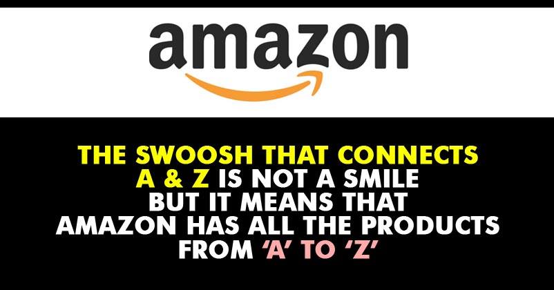
Did you think that the yellow swoosh at the lower end of Amazon arrow is a smiley?? If yes, then you were wrong.
The arrow that points from A to Z literally means that Amazon provides a wide range of products, everything from A to Z.
5. Google

You all will be well aware of the fact that Google always keeps its homepage clean and simple.
They even designed their logo using simple letters and colors. If you notice carefully, the Google logo has four primary colors in a row and then it has been replaced by a secondary Color.
6. Coca-Cola

Most of you might not be aware of this, because it is very difficult to figure out.
But, if carefully examined, then the letter O in ‘Coca-Cola’ resembles the Denmark Flag, the happiest country on Earth.
According to what Coca-Cola says, this was not intentional. When they were aware of this fact, they quickly set up a media stunt in Denmark’s biggest airport, and started welcoming people with Coca-Cola (having Denmark Flag).

7. Wikipedia

Most of us must be using Wikipedia daily to get some information about any topic.
We can clearly see that the logo of Wikipedia is a globe made up of puzzle pieces. But the interesting fact is that the globe is not complete and is still missing on some pieces.
The reason behind this is the fact that Wikipedia is constantly evolving as the world and is never complete. Its news continues to expand day by day.
8. FedEx

The famous courier service provider carefully designed its logo in two different colors.
One can easily see the arrow between ‘E and x’. This arrow represents the fact that they are always trying to move forward and provide better service.
9. Toyota

It is actually difficult to figure out the hidden message of the Toyota Logo.
As you can see, there are three ellipses in the logo. These ellipses represent three hearts: the heart of the customer, the heart of the product, and the heart of progress in the field of technology.
The 2nd hidden message is quite amazing.
One can also find out the name TOYOTA from their logo;

10. Audi

You all might have wondered why there are 4 circles in the logo of Audi and what these circles means.
Actually, these 4 circles represent the 4 companies that were a part of the Auto-Union Consortium in 1932. Those 4 companies were — DKW, Horch, Wanderer and Audi.
Were you aware of these hidden messages?? Do you know any other hidden messages??


